


Software agency making Django, Vue and Angular products for clients since 2014

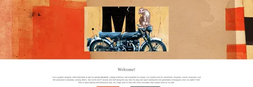
Graphic designer and artist in Nashville creating logos, branding, book design and illustrated art series
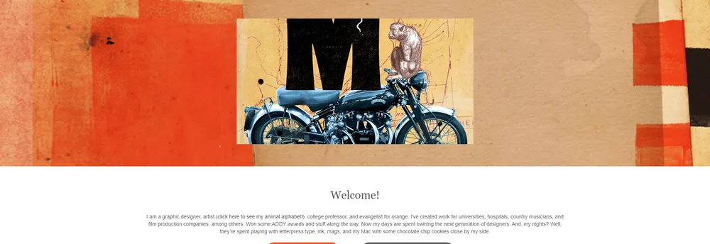
Leslie Haines Design is the studio of a Nashville graphic designer and artist. It combines client design work, such as logos, identities and advertising, with personal art projects and exhibitions.
Profile written by TrustList from the business's own published information, Oct 2026.
As of 2026-10-10. Organic ranks only; sponsored placements are never ranks.
Used it? Your experience helps other buyers decide.
Write a reviewNo questions yet. Be the first to ask about Leslie Haines Design.
Similar listings buyers compare against this one.
Software agency making Django, Vue and Angular products for clients since 2014
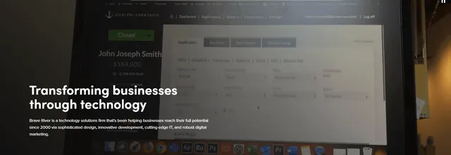
Technology firm for web design, custom software, digital marketing and managed IT, now part of Vertikal6

Tucson creative studio offering branding, marketing, video and web development for purpose-driven organisations

Digital marketing agency offering SEO, content marketing, link building, PPC and conversion optimisation

Marketplace agency helping online shops and brands sell on Amazon, eBay, Kaufland and other European marketplaces

Technology services firm providing managed mobility, cloud, cybersecurity and application work for government and enterprises
The newest guides and analysis from TrustList Insights.
%22%2F%3E%3C%2Fmask%3E%3ClinearGradient%20id%3D%22bar%22%20x1%3D%220%22%20y1%3D%220%22%20x2%3D%220%22%20y2%3D%221%22%3E%3Cstop%20offset%3D%220%25%22%20stop-color%3D%22%23fde68a%22%20stop-opacity%3D%220.6%22%2F%3E%3Cstop%20offset%3D%22100%25%22%20stop-color%3D%22%23f59e0b%22%20stop-opacity%3D%220.12%22%2F%3E%3C%2FlinearGradient%3E%3C%2Fdefs%3E%3Crect%20width%3D%22640%22%20height%3D%22360%22%20fill%3D%22url(%23bg)%22%2F%3E%3Crect%20width%3D%22640%22%20height%3D%22360%22%20fill%3D%22url(%23g1)%22%2F%3E%3Crect%20width%3D%22640%22%20height%3D%22360%22%20fill%3D%22url(%23g2)%22%2F%3E%3Cpath%20d%3D%22M-40%20327.3%20Q%20200.6%20154.6%20680%20106.2%22%20fill%3D%22none%22%20stroke%3D%22%23ffffff%22%20stroke-opacity%3D%220.038%22%20stroke-width%3D%2229.6%22%2F%3E%3Crect%20width%3D%22640%22%20height%3D%22360%22%20fill%3D%22url(%23dots)%22%20mask%3D%22url(%23dotmask)%22%2F%3E%3Cg%20transform%3D%22translate(449.4%20184.2)%20scale(1)%20translate(-470%20-180)%22%3E%3Crect%20x%3D%22464%22%20y%3D%22112%22%20width%3D%2212%22%20height%3D%22186%22%20rx%3D%226%22%20fill%3D%22%23ffffff%22%20fill-opacity%3D%220.9%22%2F%3E%3Crect%20x%3D%22394%22%20y%3D%22296%22%20width%3D%22152%22%20height%3D%2216%22%20rx%3D%228%22%20fill%3D%22%23ffffff%22%20fill-opacity%3D%220.9%22%2F%3E%3Cline%20x1%3D%22356.6%22%20y1%3D%22136.5%22%20x2%3D%22583.4%22%20y2%3D%2287.5%22%20stroke%3D%22%23ffffff%22%20stroke-width%3D%229%22%20stroke-linecap%3D%22round%22%2F%3E%3Ccircle%20cx%3D%22470%22%20cy%3D%22112%22%20r%3D%2213%22%20fill%3D%22%23f59e0b%22%20stroke%3D%22%23ffffff%22%20stroke-width%3D%224%22%2F%3E%3Cpath%20d%3D%22M356.6%20136.5%20L312.6%20212.5%20M356.6%20136.5%20L400.6%20212.5%22%20stroke%3D%22%23fde68a%22%20stroke-opacity%3D%220.8%22%20stroke-width%3D%222%22%2F%3E%3Cellipse%20cx%3D%22356.6%22%20cy%3D%22206.5%22%20rx%3D%2226%22%20ry%3D%228%22%20fill%3D%22%23f59e0b%22%20stroke%3D%22%23fde68a%22%20stroke-width%3D%221.3%22%2F%3E%3Cellipse%20cx%3D%22356.6%22%20cy%3D%22197.5%22%20rx%3D%2226%22%20ry%3D%228%22%20fill%3D%22%23f59e0b%22%20stroke%3D%22%23fde68a%22%20stroke-width%3D%221.3%22%2F%3E%3Cellipse%20cx%3D%22356.6%22%20cy%3D%22188.5%22%20rx%3D%2226%22%20ry%3D%228%22%20fill%3D%22%23f59e0b%22%20stroke%3D%22%23fde68a%22%20stroke-width%3D%221.3%22%2F%3E%3Cellipse%20cx%3D%22356.6%22%20cy%3D%22179.5%22%20rx%3D%2226%22%20ry%3D%228%22%20fill%3D%22%23f59e0b%22%20stroke%3D%22%23fde68a%22%20stroke-width%3D%221.3%22%2F%3E%3Cpath%20d%3D%22M406.6%20212.5%20H306.6%20A50%2026%200%200%200%20406.6%20212.5%20Z%22%20fill%3D%22%23ffffff%22%2F%3E%3Cpath%20d%3D%22M583.4%2087.5%20L539.4%20163.5%20M583.4%2087.5%20L627.4%20163.5%22%20stroke%3D%22%23fde68a%22%20stroke-opacity%3D%220.8%22%20stroke-width%3D%222%22%2F%3E%3Cellipse%20cx%3D%22583.4%22%20cy%3D%22157.5%22%20rx%3D%2218%22%20ry%3D%226%22%20fill%3D%22%23fde68a%22%20fill-opacity%3D%220.8%22%2F%3E%3Cpath%20d%3D%22M633.4%20163.5%20H533.4%20A50%2026%200%200%200%20633.4%20163.5%20Z%22%20fill%3D%22%23ffffff%22%2F%3E%3C%2Fg%3E%3C%2Fsvg%3E) Venture Capital
Venture Capital10 Oct 2026
Our count of 84 October items finds 73 named a lead investor, 63 a stage and 6 a company-stated valuation, while none of the 48 customer or…
%22%2F%3E%3C%2Fmask%3E%3ClinearGradient%20id%3D%22bar%22%20x1%3D%220%22%20y1%3D%220%22%20x2%3D%220%22%20y2%3D%221%22%3E%3Cstop%20offset%3D%220%25%22%20stop-color%3D%22%23fde68a%22%20stop-opacity%3D%220.6%22%2F%3E%3Cstop%20offset%3D%22100%25%22%20stop-color%3D%22%23f59e0b%22%20stop-opacity%3D%220.12%22%2F%3E%3C%2FlinearGradient%3E%3C%2Fdefs%3E%3Crect%20width%3D%22640%22%20height%3D%22360%22%20fill%3D%22url(%23bg)%22%2F%3E%3Crect%20width%3D%22640%22%20height%3D%22360%22%20fill%3D%22url(%23g1)%22%2F%3E%3Crect%20width%3D%22640%22%20height%3D%22360%22%20fill%3D%22url(%23g2)%22%2F%3E%3Cpath%20d%3D%22M-40%20347.9%20Q%20156.1%20197.9%20680%2043.3%22%20fill%3D%22none%22%20stroke%3D%22%23ffffff%22%20stroke-opacity%3D%220.046%22%20stroke-width%3D%2229.2%22%2F%3E%3Crect%20width%3D%22640%22%20height%3D%22360%22%20fill%3D%22url(%23dots)%22%20mask%3D%22url(%23dotmask)%22%2F%3E%3Cg%20transform%3D%22translate(460.1%20190.9)%20scale(1)%20translate(-470%20-180)%22%3E%3Cg%20transform%3D%22rotate(-6.8%20470%20180)%22%3E%3Cpath%20d%3D%22M360%20124%20H530%20L588%20180%20L530%20236%20H360%20a14%2014%200%200%201%20-14%20-14%20V138%20a14%2014%200%200%201%2014%20-14%20Z%22%20fill%3D%22%23ffffff%22%2F%3E%3Ccircle%20cx%3D%22536%22%20cy%3D%22180%22%20r%3D%2211%22%20fill%3D%22%2392400e%22%2F%3E%3Crect%20x%3D%22378%22%20y%3D%22154%22%20width%3D%22118%22%20height%3D%2216%22%20rx%3D%228%22%20fill%3D%22%23f59e0b%22%2F%3E%3Crect%20x%3D%22378%22%20y%3D%22184%22%20width%3D%2280%22%20height%3D%2210%22%20rx%3D%225%22%20fill%3D%22%2392400e%22%20fill-opacity%3D%220.45%22%2F%3E%3Crect%20x%3D%22378%22%20y%3D%22202%22%20width%3D%2256%22%20height%3D%2210%22%20rx%3D%225%22%20fill%3D%22%2392400e%22%20fill-opacity%3D%220.3%22%2F%3E%3C%2Fg%3E%3Cpath%20d%3D%22M588%20140%20q60%20-40%2080%20-110%22%20fill%3D%22none%22%20stroke%3D%22%23fde68a%22%20stroke-width%3D%222%22%20stroke-dasharray%3D%225%207%22%20stroke-opacity%3D%220.8%22%2F%3E%3Ccircle%20cx%3D%22421.2%22%20cy%3D%2275.3%22%20r%3D%2215.7%22%20fill%3D%22none%22%20stroke%3D%22%23fde68a%22%20stroke-opacity%3D%220.2%22%20stroke-width%3D%221.5%22%2F%3E%3Ccircle%20cx%3D%22585.8%22%20cy%3D%22245.8%22%20r%3D%2212.7%22%20fill%3D%22none%22%20stroke%3D%22%23fde68a%22%20stroke-opacity%3D%220.2%22%20stroke-width%3D%221.5%22%2F%3E%3Ccircle%20cx%3D%22460.2%22%20cy%3D%22260.2%22%20r%3D%2213.5%22%20fill%3D%22none%22%20stroke%3D%22%23fde68a%22%20stroke-opacity%3D%220.4%22%20stroke-width%3D%221.5%22%2F%3E%3Ccircle%20cx%3D%22384.9%22%20cy%3D%2280.6%22%20r%3D%2213.1%22%20fill%3D%22none%22%20stroke%3D%22%23fde68a%22%20stroke-opacity%3D%220.3%22%20stroke-width%3D%221.5%22%2F%3E%3Ccircle%20cx%3D%22309.2%22%20cy%3D%22178.2%22%20r%3D%2215.3%22%20fill%3D%22none%22%20stroke%3D%22%23fde68a%22%20stroke-opacity%3D%220.2%22%20stroke-width%3D%221.5%22%2F%3E%3Ccircle%20cx%3D%22542.9%22%20cy%3D%2298.3%22%20r%3D%2212.9%22%20fill%3D%22none%22%20stroke%3D%22%23fde68a%22%20stroke-opacity%3D%220.3%22%20stroke-width%3D%221.5%22%2F%3E%3C%2Fg%3E%3C%2Fsvg%3E) Artificial Intelligence - AI
Artificial Intelligence - AI10 Oct 2026
Jev answers with yes or no, a pick from a list or a score instead of prose. Andreessen Horowitz leads; Martin Casado joins the board; the…
%22%2F%3E%3C%2Fmask%3E%3ClinearGradient%20id%3D%22bar%22%20x1%3D%220%22%20y1%3D%220%22%20x2%3D%220%22%20y2%3D%221%22%3E%3Cstop%20offset%3D%220%25%22%20stop-color%3D%22%2399f6e4%22%20stop-opacity%3D%220.6%22%2F%3E%3Cstop%20offset%3D%22100%25%22%20stop-color%3D%22%232dd4bf%22%20stop-opacity%3D%220.12%22%2F%3E%3C%2FlinearGradient%3E%3C%2Fdefs%3E%3Crect%20width%3D%22640%22%20height%3D%22360%22%20fill%3D%22url(%23bg)%22%2F%3E%3Crect%20width%3D%22640%22%20height%3D%22360%22%20fill%3D%22url(%23g1)%22%2F%3E%3Crect%20width%3D%22640%22%20height%3D%22360%22%20fill%3D%22url(%23g2)%22%2F%3E%3Cpath%20d%3D%22M-40%20273%20Q%20191.7%20182.6%20680%2087.8%22%20fill%3D%22none%22%20stroke%3D%22%23ffffff%22%20stroke-opacity%3D%220.044%22%20stroke-width%3D%2242.6%22%2F%3E%3Crect%20width%3D%22640%22%20height%3D%22360%22%20fill%3D%22url(%23dots)%22%20mask%3D%22url(%23dotmask)%22%2F%3E%3Cg%20transform%3D%22translate(458.3%20187.1)%20scale(0.9)%20translate(-470%20-180)%22%3E%3Ccircle%20cx%3D%22505%22%20cy%3D%22186.4%22%20r%3D%2242%22%20fill%3D%22none%22%20stroke%3D%22%2399f6e4%22%20stroke-opacity%3D%220.5%22%20stroke-width%3D%222%22%2F%3E%3Ccircle%20cx%3D%22505%22%20cy%3D%22186.4%22%20r%3D%2278%22%20fill%3D%22none%22%20stroke%3D%22%2399f6e4%22%20stroke-opacity%3D%220.4%22%20stroke-width%3D%221.4%22%20stroke-dasharray%3D%223%208%22%2F%3E%3Ccircle%20cx%3D%22505%22%20cy%3D%22186.4%22%20r%3D%22116%22%20fill%3D%22none%22%20stroke%3D%22%2399f6e4%22%20stroke-opacity%3D%220.3%22%20stroke-width%3D%221.4%22%2F%3E%3Ccircle%20cx%3D%22505%22%20cy%3D%22186.4%22%20r%3D%22156%22%20fill%3D%22none%22%20stroke%3D%22%2399f6e4%22%20stroke-opacity%3D%220.2%22%20stroke-width%3D%221.4%22%20stroke-dasharray%3D%225%2012%22%2F%3E%3Ccircle%20cx%3D%22554.9%22%20cy%3D%22126.5%22%20r%3D%2215%22%20fill%3D%22%232dd4bf%22%20fill-opacity%3D%220.25%22%2F%3E%3Ccircle%20cx%3D%22554.9%22%20cy%3D%22126.5%22%20r%3D%229%22%20fill%3D%22%23ffffff%22%2F%3E%3Ccircle%20cx%3D%22393.3%22%20cy%3D%22217.9%22%20r%3D%2213%22%20fill%3D%22%232dd4bf%22%20fill-opacity%3D%220.25%22%2F%3E%3Ccircle%20cx%3D%22393.3%22%20cy%3D%22217.9%22%20r%3D%227%22%20fill%3D%22%23ffffff%22%2F%3E%3Ccircle%20cx%3D%22442.1%22%20cy%3D%22329.2%22%20r%3D%2211%22%20fill%3D%22%232dd4bf%22%20fill-opacity%3D%220.25%22%2F%3E%3Ccircle%20cx%3D%22442.1%22%20cy%3D%22329.2%22%20r%3D%225%22%20fill%3D%22%23ffffff%22%2F%3E%3Ccircle%20cx%3D%22505%22%20cy%3D%22186.4%22%20r%3D%2216%22%20fill%3D%22%2399f6e4%22%2F%3E%3C%2Fg%3E%3C%2Fsvg%3E) Cybersecurity
Cybersecurity10 Oct 2026
The flaw needs no credentials or user action and every iMC build before 7.3 E0713 is affected. HPE published the bulletin on 8 October and…
Everything here links back to the same verified catalogue. Pick your next stop.


